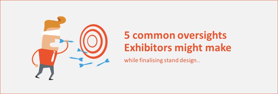
Planning for an Exhibition participation can sometimes be quite overwhelming. Starting from your overall budgeting, show selection, space booking, choosing the stand location, planning the exhibits, logistics plans and of course finalising the Stand Design; there’s a lot to do!
Below are 5 common oversights which Exhibitors may make while finalising their Stand Design:
1: Losing focus of the ‘exhibit’: During the Stand design process, exhibitors are surrounded with many fancy looking stand design options from various agencies. This is where the risk lies, the risk to lose focus on the real ‘exhibit’ or failure to implement your marketing objective through the Design.
The design and choice of structures, shapes, colours, materials and all other elements must bring more focus on the brand and highlight the product and information display at the stand.
Many a times, the stand design might be very attractive and draw a lot of attention just by itself. But the purpose gets lost if the design elements overshadow the presence of the exhibits and the brand instead of highlighting them !
2: Not engaging beyond the Eye: Trade shows are certainly battle grounds for every exhibitor. Exhibitors use stand design and its elements as one of the primary tools to attract visitors attention. However, with all the exhibitors aiming at the same sensory, it may be worthwhile to go beyond the norm.
By creatively engaging the senses of sound, smell, taste and touch, you can differentiate yourself by creating unique memories and experiences for your visitors!
3: Too much in too little: Preparing for Exhibitions can get very enthusing, one may want to present as many products and information as possible. However, it is important to carefully curate and select what you want to exhibit in your booth. It should be limited and relative to the size of your stand. The selection of exhibits should also be done keeping in mind the interest of the visitors expected at the show. The same concept applies to graphics and information panels. Only put up as much information that can be quickly understood by the visitors in the fast paced environment of exhibitions.
4: Reinventing the wheel: Many exhibitors tend to continually experiment with the design, oscillating between successful and unsuccessful strategies. This may not be the wisest approach as excessive experimentation will cost time, money, energy and it may create instances of inefficient exhibiting.
When you arrive at a design style or basic layout that works well for you, stay with it! Use it repeatedly and incorporate any additional improvements after each experience. This can become your advantage as you can get maximum exhibiting efficiency at minimum effort.
5: Penny wise, pound foolish: Many exhibitors may not recognise the immense hidden value of a professional stand design and fabrication. After investing all the money in renting booth space, arranging travel, logistics, marketing literature, booth staff; compromising on the stand’s presentation could be a blunder. The stand design serves several critical functions including attracting quality visitors, affecting your brand image etc. Thus, marginal savings by compromising the stand design and its build quality may fall heavy on the total investment.
Always set aside a proper budget for stand presentation when planning for your exhibition expense. A well-presented small stand does far more good than a poorly presented large stand.
A shrewd exhibitor once remarked
“ If I just want to save money, why would I participate at Exhibitions at all? ”
*********************************************************************
Author: Rohit Saraogi is a co-founder & Director at Design Desk – a leading Exhibition & Environment Design Agency in India since 2005.
Connect with Rohit on Linked In. For more updates follow Design Desk on LinkedIn, Twitter, Facebook & Youtube.


